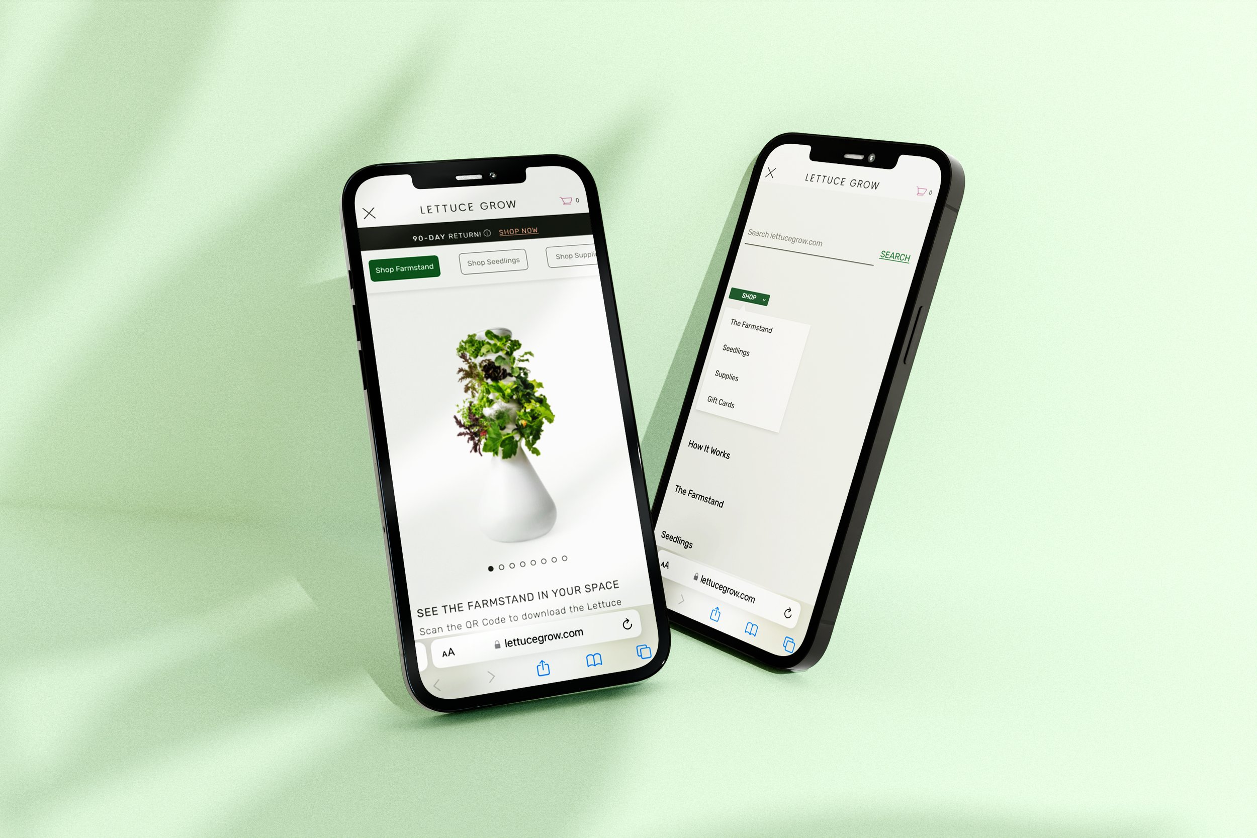
GROW YOUR OWN GROCERIES
Lettuce Grow is a sustainable food company that offers a self-watering,
self-fertilizing hydroponic Farmstand
for growing a variety of plants indoors
or outdoors.
-
Duration
July 2022 - August 2022
-
My Role
Product Designer
-
Team
Luis Jimenez - Product Manager
Ramiz Jan - Product Analysis
Jorge Cortez - Front End Developer
-
Tools
Figma
Jira
Zeplin
Google Optimize & Analytics
Fullstory
Let’s look at the data

Key takeaways from scroll map
Time frame: June 2, 2022 - July 3, 2022
94% (50.5K) of mobile users stay within the top shopping page but only 35% (17.5K) scrolled to the bottom of the page
96% (41K) of desktop users stay within the top page but only 34% (14K) scrolled to
bottom of the pageThe users are getting lost within the shop page because of the endless scrolling
of all the products
Key takeaways from heat map
The product icon navigations are not effective because user are not
utilizing and clicking on those buttonsUsers are spending more time swiping through product images, reviews, selecting farmstand size, growing location and adding to cart
Users are leaving to the home page and "how it works" page to learn
more about the productsMobile bounce rate: 66%
Desktop bounce rate: 59%
So what’s our goal
Goals
Increase product sales and decrease bounce rates
Enhance user experience within the shopping navigation
KPI Metrics: Farmstand, Seedlings, Supplies and Order conversations
Solution Hypothesis:
If we add a drop down menu that will split the shop page into individual product pages, then we will improve user experience and lead to better conversion of orders because the user will not get distracted by non relevant products.
Let’s do some research
Why drop down menu?
Assist users to find exactly what they're looking for which saves time and eliminates endless scrolling
Prioritizes information architecture, content layout and organization
Avoids confusion and frustration while keeping the user engaged
What are drop down menus best practices?
Avoid long drop down menus with too many options or have more than two levels
Design for clarity, space and accessibility
Make sure drop down animations doesn't compromise performance
and experience
What does our competitors' shopping navigation look like?
Gardyn: great example of how to categorize and organize content on the navigation menu
Rise Gardens: utilizing images on drop down menu provides a visual context of what the products look like
AeroGarden: minimal options on drop down menu and contains dropdown indicator
Time to create variations
Variant A: Text Dropdown
Key design elements:
Using an arrow icon as an indictor to the user that it's a drop down menu
Having a sticky horizontal menu so the user doesn't have to scroll to the top of the page to navigate to other products
Products are green once the user hovers over drop down menu to imply clickable buttons
User has access to drop down menu anytime
Variant B: Image Dropdown
Key design elements:
Once user selects shop button, a 2x2 submenu will appear with image and text
Prioritize space by paying attention to padding and margins to make it easy for users to digest the options available on 2x2 submenu
Once user hovers each product, a second image will appear and text will turn green to signify clickable button
Focused on making sure the animation was smooth and simple without hindering the speed and experience of the dropdown menu
Making sure images were clear and both images for each product being consistent relevant to size
And the winner is
After running the test for a month, the data showed that the text dropdown was the winner due to:
25% increase in Farmstand sales
decreased bounce rate by 30%
increased how far down users were scrolling down to the bottom of the page, meaning users were engaged and not ignoring content
more sessions and conversations than BOTH Variant B and the Original combined
Check out the live dropdown menu on Lettuce Grow website:
What I learned
How to confidently present and defend my design decisions by:
defining the project goals in the beginning of my presentation. This will reassure with stakeholders that my vision is aligned with theirs, which will result in them having a positive trust and confidence in me as a designer.
referring back to data and research studies. Take advantage to present user research, quantitative or qualitative data, analyzing what competitors are doing, UX design best practices, etc.
knowing who I’m are talking to. My audience can range from clients, to developers, to other designers on my team. The more time spent catering my explanations to the vocabulary of a specific stakeholder, the easier it will be to understand and digest.
minimizing the number of design options. Always consider alternative solutions, but don’t overwhelm decision-makers with too many options.
being comfortable with being uncomfortable. Remember that it’s not a “right or wrong” contest and everyone is on the same team. Ask for help and be open minded to feedback. That's the only way you grow as a designer!


