Project Overview
Problem
Build a new mobile design system for a start up called CURB that helps drivers find and reserve parking spots in the Bay Area.
Goals
Scalable: a system that evolves to the changing needs of the products and organization
Efficient: a system that saves time and energy. Standardized and resuable components
reinforces branding and provides a consistent look and user experienceAccessible: a system that meets the three levels of conformance in the Web Content Accessibility Guidelines (A, AA, and AAA). CURB is committed to creating products that
are accessible to people with a wide range of disabilities, including visual, auditory, cognitive, and motor impairments.Multidisciplinary: a system that facilitates smoother collaboration and communication between designers, developers, product managers, user researchers, and many other stakeholders.
Documentation: create a detailed and organized documentation of design system
Design System
Results
CURB now has a collection of design standards, guidelines, and a common framework that is efficient, scalable, accessible, multidisciplinary and documented.
Documentation is key to the success and sustainability of the system. I used Figma to create a design system file that has organized pages of grid system, spacing, color palettes, typography, and libraries of shared components and styles. We also maintained documentation on Atlassian Confluence.
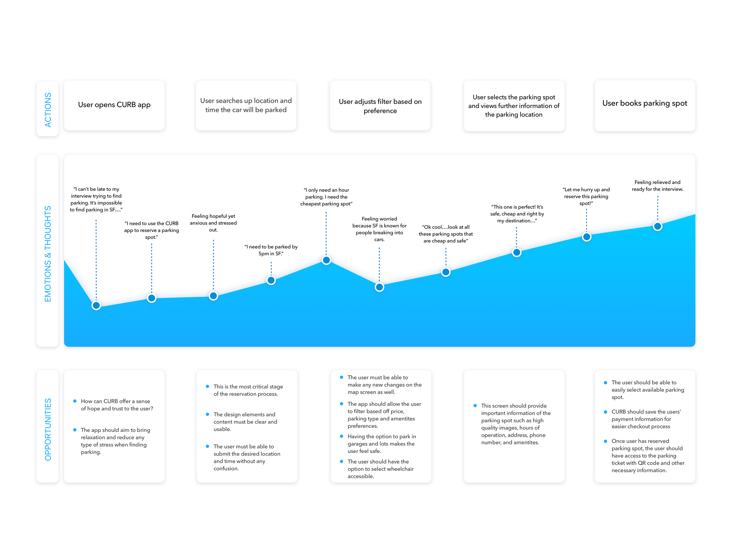
I was able to interview drivers and create journey maps to better empathize with the driver. Creating a design system allowed me to design low and high fidelity mobile screens that assists drivers to find and reserve parking spots near their desired destination. I continued to do user testing and iterations on my prototypes.
Journey Map

Low Fidelity Prototype

User Testing: Low Fidelity Prototype
Positive feedback:
Users were able to find a parking spot that catered to their needs
Simple and straightforward user flow
They liked that there was a wheel chair accessible filter
Recommendations:
The landing page to be a map with the freedom to search location and add check in and check out time
Adding another screen that notifies the user that they have successfully reserved the parking spot
High Fidelity Prototype

Clickable Prototype
Conclusion
Having the opportunity to work at start up was an amazing learning experience. I learned how critical it is to be consistently communicating with the team and making sure everyone is on the same page. I learned how to correctly provide user flows, detailed components, assets and specs to developers during the hand off stage on Figma. Even though I was the only designer, I was able to complete the project while considering the business goals and strict deadline. It was very challenging at first working for a company that had a different design process but I had to adapt to the company’s plan of putting the designs out and doing the testing and modifications along the way. The engineers were able to develop my designs and present it to investors.


